The first screen asks a question instead of making a claim.
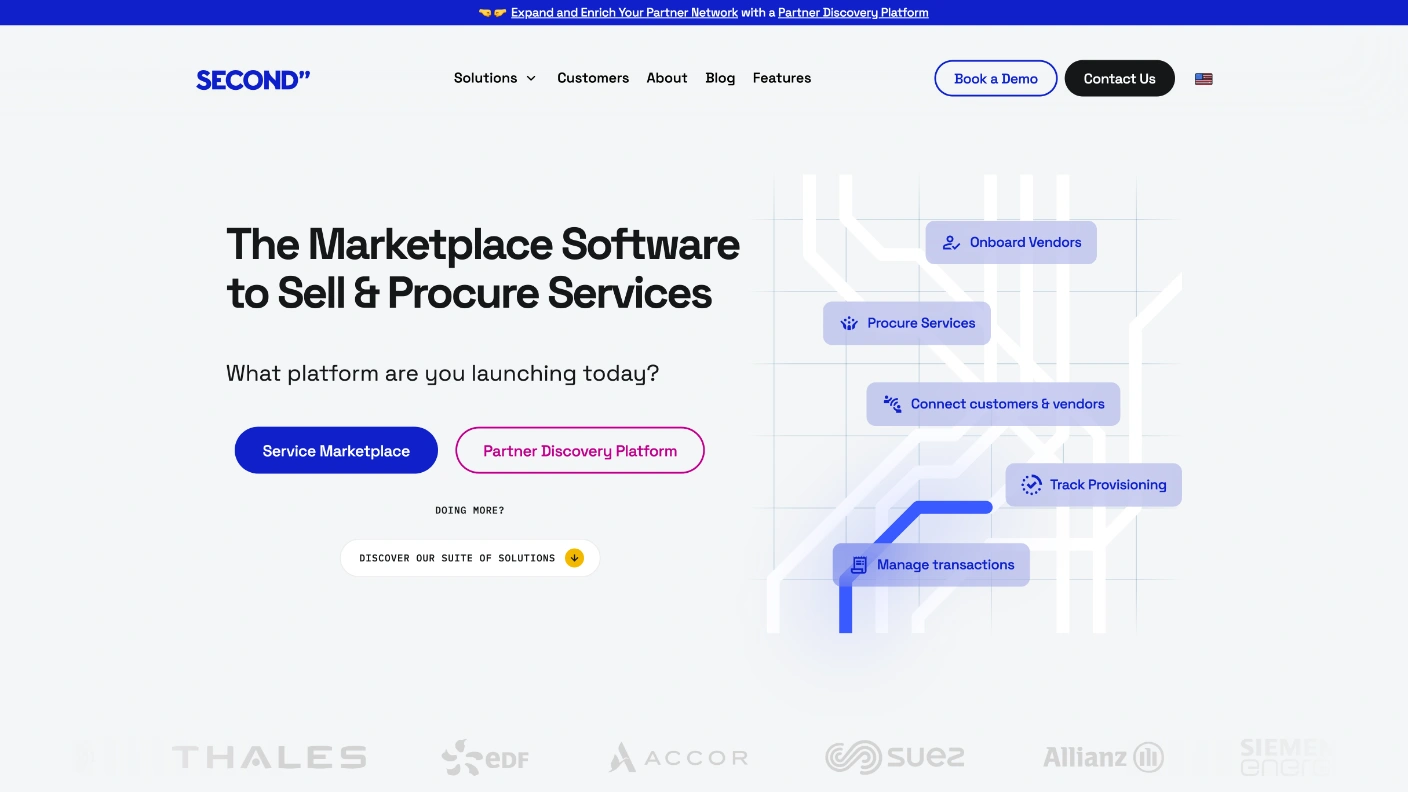
The homepage states the category in one line — "The Marketplace Software to Sell & Procure Services" — and then does something a software homepage almost never does: it asks the visitor a question. "What platform are you launching today?", with two buttons under it. Before any feature, any screenshot, any pricing, the page forks by intent.
That fork is the whole design argument. Second is six products wearing one name, and the alternative to asking is a homepage that lists all six and lets the visitor guess which one is theirs. The question turns a taxonomy problem into a single click, and everything below it — the solution cards, the enterprise use cases, the About page's economic case — exists to confirm the choice rather than to make it.
My work was the front pages: the homepage, the About argument, and the platform pages each product lands on. Design, not the build.
The Question, Not the Claim
Two buttons do the work a whole page of copy would fail at."What platform are you launching today?" sits directly under the category line, with Service Marketplace and Partner Discovery Platform as the only two things to press. A third route, DISCOVER OUR SUITE OF SOLUTIONS, is set smaller and lower for the visitor who does not yet know. Three options, ranked by how sure the visitor is.
Onboard Vendors, Procure Services, Connect customers & vendors, Track Provisioning, Manage transactions. Five chips on a flow line, each one a thing the buyer already does by hand today. The illustration is the product tour, placed where a stock hero image usually goes.
One Colour Each
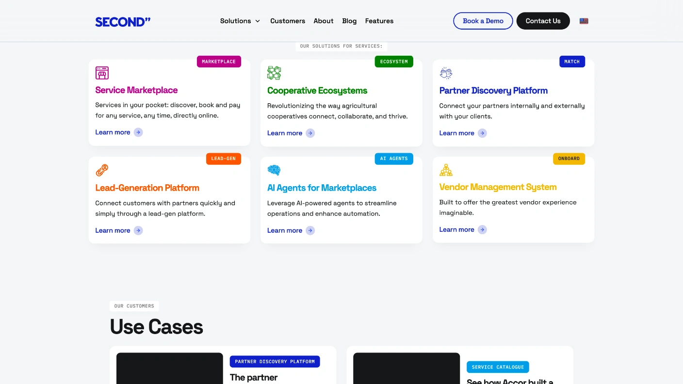
A range becomes a system when every item gets its own mark.Six products, each with its own colour, its own icon and a tag chip in the corner — MARKETPLACE, ECOSYSTEM, MATCH, LEAD-GEN, AI AGENTS, ONBOARD. The chips are the index: a visitor scanning for their own situation reads six words rather than six paragraphs, and the colour then follows that product onto its own page.
"The partner ecosystem that reduces electrical power station downtimes." "See how Accor built a global services catalogue with Second." Each card leads with the outcome and the logo, so the proof reads as a customer's sentence rather than a vendor's.
Scale as Four Cards
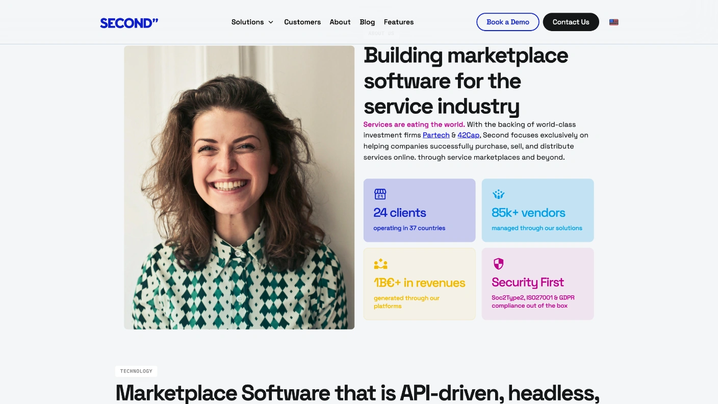
The numbers are set as a grid, so nobody has to read a paragraph to find them.24 clients in 37 countries. 85k+ vendors. €1B+ processed. SOC 2 Type 2, ISO 27001, GDPR. Four tinted cards, one fact each, sitting next to a photograph rather than under a wall of text — the compliance card carries the same weight as the revenue card because for an enterprise buyer it is the same kind of gate.
"With the backing of world-class investment firms Partech & 42Cap." One sentence, no logo wall. The credibility is placed where a sceptical reader is already reading rather than staged as its own section.
It's the Economy, Stupid
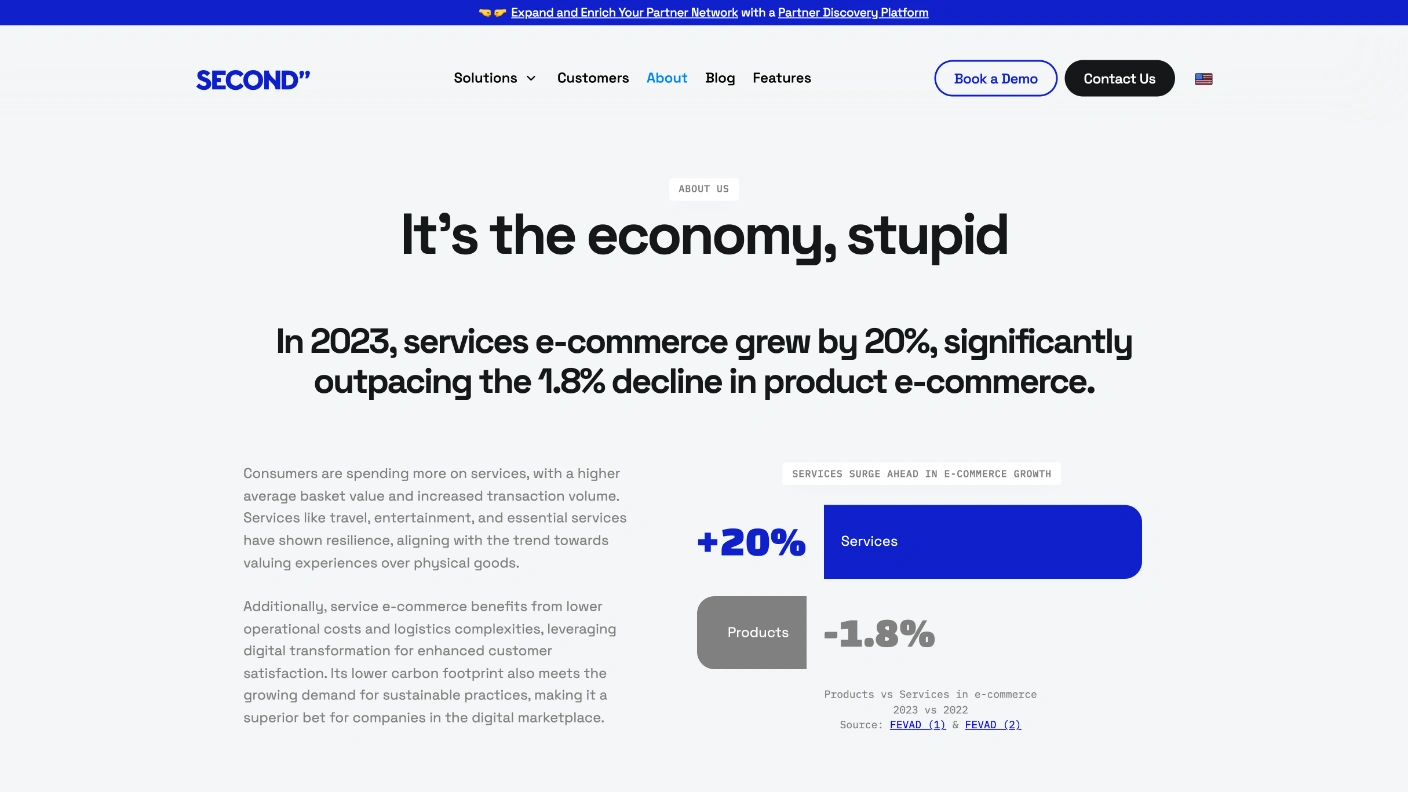
The About page argues for the category before it argues for the company.Services e-commerce grew 20% in 2023 while product e-commerce fell 1.8%, sourced to FEVAD and drawn as two bars — a big blue one and a small grey one. The page spends its opening on why this market exists at all, and only then on who Second is. For a category buyers do not have a name for, that order is the argument.
Carville's line is a joke the reader finishes themselves, and it buys the attention that a chart about e-commerce growth rates would otherwise have to earn cold. Underneath it the manifesto is set as plain cards: the winning service organisations will be the ones that became e-commerce platforms.
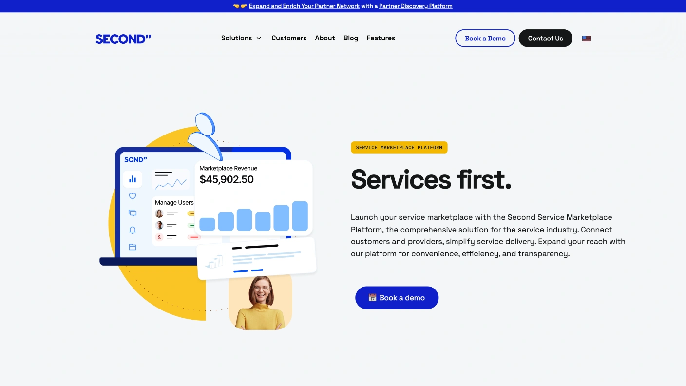
Services First
Two words where the homepage needed eleven.Each platform page inherits its colour from its card on the homepage — the yellow chip here matches the yellow the visitor pressed — and then drops to a two-word headline. The homepage had to name a category; this page only has to confirm one choice, so it says the least it can.
Marketplace Revenue, $45,902.50, and a bar chart climbing. The product UI is drawn rather than captured, which keeps the page honest about being an illustration while still answering the only question a marketplace operator has: does it show me what I am making?
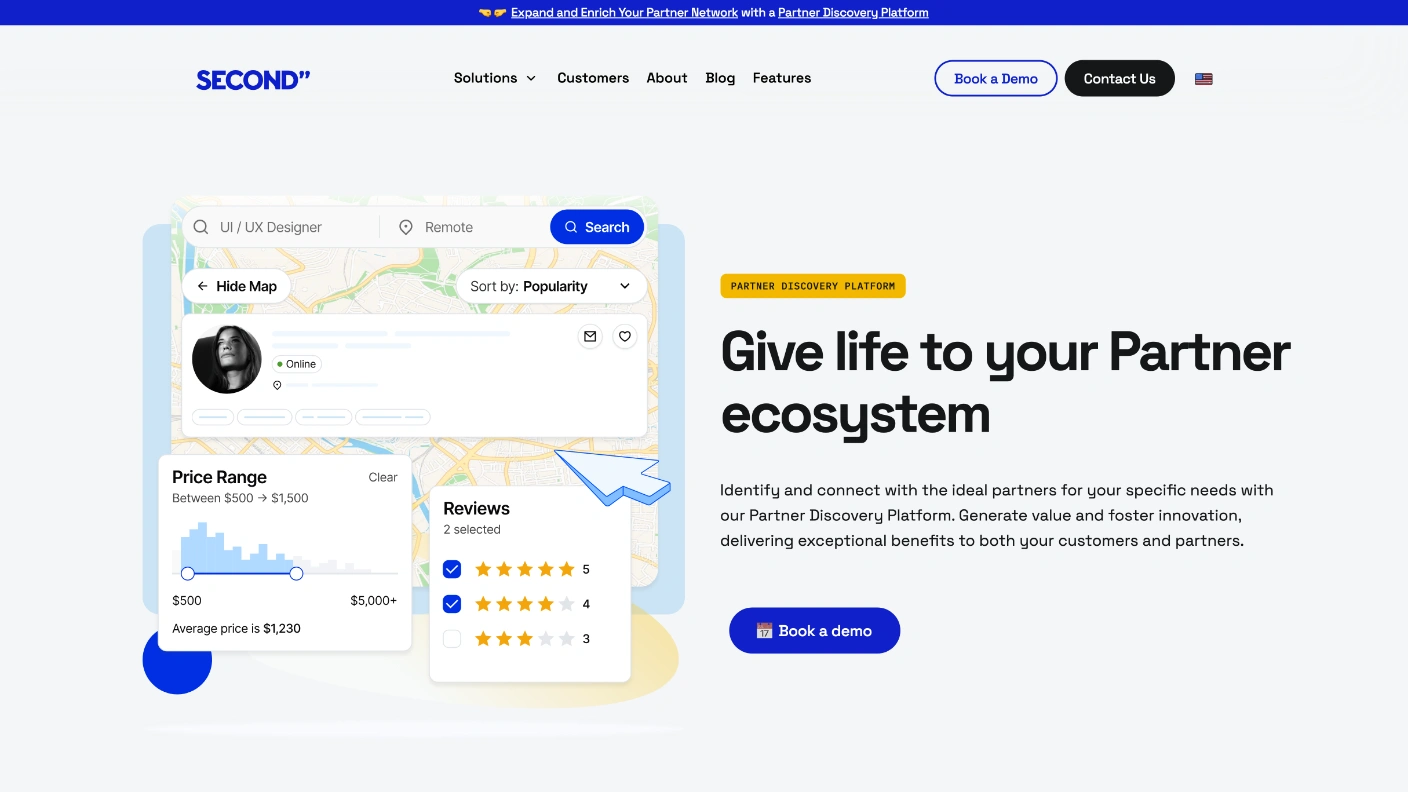
The Other Button
Same skeleton, different colour, different promise.The homepage's second button lands here. The page is built from the same parts as the first platform page — chip, short headline, paragraph, demo button, drawn UI — so the two feel like one product family rather than two sites, and the difference the visitor sees is the one that matters: what this platform is for.
Six products need six pages, and six bespoke pages would drift within a year. Fixing the skeleton and varying only the colour, the headline and the illustration is what lets the seventh product ship looking like it belongs.